Tuesday, September 27, 2011

London Fashion Week

London Fashion Week was short and didn't showcase a huge amount of labels but I have managed to grab some images of a few I liked. 

Burberry Prorsum - loved the simple black tee worked with statement pieces and their ever changing take on the legendary trench coat.  The hats were also a really cool part of the looks along with great bags and heels.

Mary Katrantzou - she has a true gift to mix together some of the crazy prints she does and to bring it all together as amazing pieces.  The silhouettes are also great, ranging from feminine to suits.

Mulberry - more of the pastels we saw in New York with a few darker looks towards the end of the show.  As always with Mulberry they presented bags which will be on everyone's 'i want' list for the rest of the season.  I already NEED the jade green Bayswater in the far left image!

Something a little more fancy

With the Emmys and Brownlow Medal ceremony recently I got into looking at gowns fit for a black tie event or the red carpet so I thought I'd just post my selection.  I love looking at these kind of dresses you could only ever dream of wearing, or having an event to wear it to! 


Wednesday, September 21, 2011

Converted

When Chanel released the "Boy Bag Collection" I was quick to judge harshly and refused to like the new range of handbags and wallets.  How could Lagerfeld throw in anything that even leans towards androgyny?  I mean with the 2.55, the classic flap and the Mademoiselle ranges are all extremely feminine.  But very recently something has changed, I don't know what but I have been converted to loving this collection.  I would go as far as saying I would prefer one of these bags over possibly the world's most effortlessly chic, timeless handbag the black quilted classic flap, because everyone seems to be carrying one these days.  The Boy Bags are much less common but still recognisable as Chanel to a half trained eye.  I'm defnitely in lust, deep lust and love may soon be coming...


 And some favourite individual pieces...

Match made in heaven

Australian accessories label Oroton has tried to revive its image and become popular among the younger, fashionable crowd.  As far as the designs go they are doing pretty well and there are a few pieces I definitely wouldn't say no to.  To further boost their new found youth they have hunted down the amazing street style photographer Tommy Ton of Jak & Jil (jakandjil.com).  Such a great choice of photographer for the times, when street style blogs are taking over fashion and forcing traditional media to reevaluate how they do things.  It looks as though Ton has shot the images as he would on the street outside a runway show, steering clear of studios and an 'over set up' feel.  Having a widely known, of the monent, international photographer could also boost exposure for Oroton more than they'd imagine.


Tuesday, September 20, 2011

Short wrap up of the Emmys

The Emmys could not be held at a worse time in terms of coverage in fashion media.  In the middle of September we have hundreds of new season runway shows to check out and not much time for television stars in pretty gowns.  Of course there will always be the shockers but I am only going to post a few images of some of my favourite celeb looks.  Elie Saab did really well, being worn by a fairly large amount of women, and why wouldn't they choose him?  Lately he can do no wrong!

New York Fashion Week

Here in Australia, the temperatures are already starting to rise as we shift into summer. So each September I absolutely adore seeing next year’s northern hemisphere spring/summer collections just in time to draw inspiration into my summer wardrobe.  I’ve picked up on a few trends that I am really loving: pastels, knee length skirts and prints galore... graphic prints on plain white or black, cute candy prints and florals of all varieties. 

I couldn’t find just one label that I absolutely loved so I managed to narrow it down to five.  So I apologise for the overly long post but this amount of new material only comes around twice a year in the world of fashion.  And of course, I will try to evaluate London, Paris and Milan as well... all in good time though (uni assessment season is coming around extremely fast much to my horror).

Preen
I’ve always had a soft spot for Preen and this collection has only reinforced that.  Around nine of the looks from the beginning of the show all utilised some element of a pastel, square print that has me obsessed.  The colours, the prints, the styles it was all just perfect in my eyes.

Zac Posen
Posen included a fair few formal/ball gowns in his show which is something not a lot of others have done.  It’s not a bad idea since he doesn’t have the luxury of couture shows but still wants to establish himself as a big player in the awards ceremony circuit, if you could call it that.  After Carrie Bradshaw’s three bridesmaids’ dresses which were all perfectly matching but mismatched Posen has caught my eye as a maker of amazing gowns.  Darker colours have mainly be used, not an obvious choice for spring or summer but he makes it work.  I also like the ‘suit jacket feel’ that appears in the first few looks.
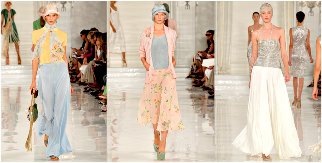

Ralph Lauren
Definitely channelling The Great Gatsby, he was the costume designer for the original movie, Lauren has ticked all the boxes – pastels, great hats, 1920s silhouettes.  All this is getting me even more excited for the new Great Gatsby movie currently being shot in Sydney, hopefully it will do the book justice!

Alice + Olivia
What a mix!  There was everything from 1960s and 70s inspired styles, neon colours, pretty florals and candy stripes.  I don’t know how they managed to incorporate all of these ‘ingredients’ and not dish up a less than appetising product but they did it.  And I am loving the hats, nothing says summers day quite like a bright oversized brimmed hat. 

Derek Lam
Derek Lam’s collection comprised of patterns, prints, bold colours and knee length skirts.  I know, it sounds like every other designer I have talked about but I don’t know what it is, I just love it all.  The first word that popped into my head while viewing the stills from the show was ‘cool.’  It just all came together perfectly and had a great summery feel to it.  He also incorporated some leather into the collection which is something I haven’t seen as much of as previous seasons.


Cannot wait to get into pastels this summer!  But I must keep an open mind and wait to see what the next few weeks deliver.

Sunday, September 11, 2011

An amazing exhibition!

As a fan of Charlotte Smith's books I was ecstatic to hear that a small exhibition of some of the clothes from Dreaming of Chanel would be coming to Brisbane!  The exhibition finally arrived, and it did not disappoint.  There were pieces from a period of about a hundred years and also a reasonably small collection of shoes, accessories and artefacts.  Illustrations of some of the garments by Grant Cowan also adorned the bold dark blue and baby pink striped walls of the gallery space.  One of my favourite outfits was a 1920s ensemble of an evening dress with a fox thrown over the shoulder as an accessory.  It reminds me so much of a photo of my great-grandmother wearing something nearly identical, a photo which I was incredibly intrigued by when I first saw it.

I'll leave you with a few photos from the collection (excuse the iphone quality)